AI Image Aspect Ratios: Choose the Right Shape Before You Generate
A practical guide to choosing square, portrait, and landscape formats for blog headers, social posts, product images, and mobile screens.
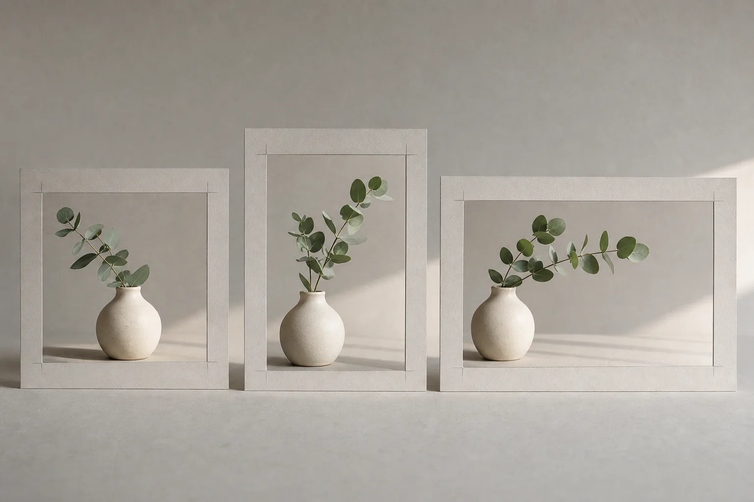
The shape of an image is not a finishing detail. It changes where the subject sits, how much background the model invents, and whether the important part survives when the image reaches a real layout.
A common workflow is to generate a square image, fall in love with it, and then discover that the blog needs a wide banner and the social post needs a tall crop. By that point, the face, product, or focal object may be too close to an edge. A few seconds of planning before generation avoids most of that repair work.
Start with the final placement
Do not begin with "What ratio looks best?" Begin with "Where will this image appear?"
- 1:1 square is dependable for gallery cards, profile posts, product thumbnails, and experiments where you have not chosen a destination yet.
- 4:5 portrait uses more vertical space in many social feeds and suits people, products, food, and simple stacked scenes.
- 9:16 portrait is built for phone-first stories and short-video covers. It needs a strong vertical composition, not a square scene stretched upward.
- 16:9 landscape works for presentation slides, video thumbnails, and many article headers.
- 3:2 or 4:3 landscape feels closer to traditional photography and gives a little more height than 16:9.
Platform specifications change, and individual themes crop images differently. Check the current destination before producing a large batch.
Aspect ratio changes the composition
Imagine a prompt for a potter working at a wheel. In a square frame, the potter, hands, and wheel can form a compact triangle. In a 4:5 frame, the model has room to include the person's posture and shelves above the workbench. In a 16:9 frame, it may expand the studio sideways, placing the potter off-center and adding tools or windows.
That is why changing only the ratio can produce a substantially different picture. The model is not merely cropping a fixed scene; it is solving a new composition.
Write the composition into the prompt:
A ceramic artist shaping a bowl at a pottery wheel, medium shot, hands and clay clearly visible, subject centered within a generous safe area, warm workshop light, editorial photography, landscape composition.
"Landscape composition" is more useful than attaching a ratio alone because it explains how the scene should use the space.
Leave a safe area for unpredictable crops
Responsive websites may show the same image as a wide desktop header and a tighter mobile card. Social previews may apply another crop. Keep the essential subject away from all four edges if one file must serve several placements.
A practical safe-area test is to imagine trimming 10 to 15 percent from every side. If that would cut through a face, hand, bottle, or headline area, the composition is too fragile.
For a blog cover, ask for the focal subject near the center third and allow background around it. For a product card, keep the full silhouette visible. For an image that will carry real typography later, request uncluttered negative space without asking the image model to render the final words.
Generate separate versions when the placement matters
One master image cannot always do every job. A wide scene with two people may become confusing in a 9:16 crop; a tall full-body portrait may become a floating head in a 16:9 banner.
For important campaigns, generate purpose-built versions:
- Keep the same subject, palette, lighting, and style language.
- Change the framing instruction for each destination.
- Check that props and clothing remain reasonably consistent.
- Add text later in a layout tool, inside the safe area for that format.
If exact consistency matters more than a fresh composition, isolate the subject with the background remover and place it on canvases of different sizes. This works especially well for products and simple illustrated objects. It is less convincing when the original scene has complex shadows, reflections, or depth.
Cropping versus regenerating
Crop when the original contains enough breathing room and the focal point remains balanced. Regenerate when the crop removes context, cuts a joint awkwardly, or leaves the subject staring out of the frame.
You can also use the AI photo editor to request a broader composition, but inspect newly invented edges carefully. Architecture, repeating patterns, hands, and text-like details are common failure points in expanded scenes.
Before enlarging a final crop, confirm its pixel dimensions. Cropping discards pixels, so the remaining file may be too small for its destination. The 2x image upscaler can help when the composition is correct and only the dimensions are short.
A quick pre-generation checklist
Before opening the AI image generator, write down four things:
- the primary placement;
- the required orientation;
- the subject's safe position;
- whether the design needs empty space for text.
Generate for the most important placement first. Treat alternate crops as deliverables of their own, not as an afterthought. The result is fewer damaged compositions and a set of images that actually fit the pages they were made for.