Why Your AI Image Prompt Is Not Working: A Practical Troubleshooting Guide
Fix weak AI image results by diagnosing composition, conflicting instructions, vague style words, unwanted text, and changes that refuse to stay local.
When an AI image misses the brief, adding more adjectives is an understandable reaction. It is also how a clear prompt turns into an argument with itself.
Prompt troubleshooting works better when you treat the result as evidence. Identify the largest visible failure, change the instruction most likely to control it, and test again. Do not rewrite everything at once or you will never learn which change helped.
The subject is present, but the picture has no focus
This usually means the prompt names objects without establishing a hierarchy.
Weak version:
A bakery, bread, a baker, customers, shelves, morning, cozy, cinematic.
The model has six candidates for the main subject. Give one of them the job:
Medium shot of a baker placing a fresh sourdough loaf on a wooden counter. Customers and bread shelves remain softly out of focus in the background. Warm early-morning window light, natural editorial photography.
The revised prompt specifies the focal action, foreground, background, and camera distance. It does not need more decoration.
The image feels generic
Words such as "beautiful," "professional," and "stunning" express approval, not visual information. Replace them with observable choices.
Instead of "a beautiful professional office," describe a narrow architecture studio with tracing paper, scale models, north-facing daylight, worn cutting mats, and neutral colors. Two or three concrete details are usually enough. A long inventory can make the scene busy again.
Real specificity often comes from the job the image must perform. A hero for an article about remote work should show something the article discusses, not a generic laptop beside a plant.
The model keeps adding unwanted text
Text-like marks often appear on packaging, signs, book covers, interfaces, and clothing. If readable wording is not essential, remove the invitation:
Plain unbranded packaging with no label, no logo, and no visible text.
If the final design needs a title or product name, leave a clean area and add real typography afterward. Generated lettering can look convincing at thumbnail size while containing substitutions, repeated characters, or invented claims.
Too many instructions conflict
"Bright noon sunlight," "soft overcast light," and "dark cinematic mood" cannot all lead the scene. Neither can "minimal empty room" and a list of twelve props.
Sort the prompt into four decisions:
- subject and action;
- environment;
- composition;
- light and visual treatment.
Choose one clear direction for each. If two instructions compete, keep the one tied most closely to the purpose of the image.
The camera is in the wrong place
Models respond better to familiar framing language than to vague requests such as "show more."
- Use close-up for texture, expressions, and small objects.
- Use medium shot for a person interacting with an object.
- Use wide shot for environment and scale.
- Use top-down for flat lays, ingredients, and organized collections.
- Use eye-level for a neutral, natural view.
- Use low-angle only when you intentionally want scale or drama.
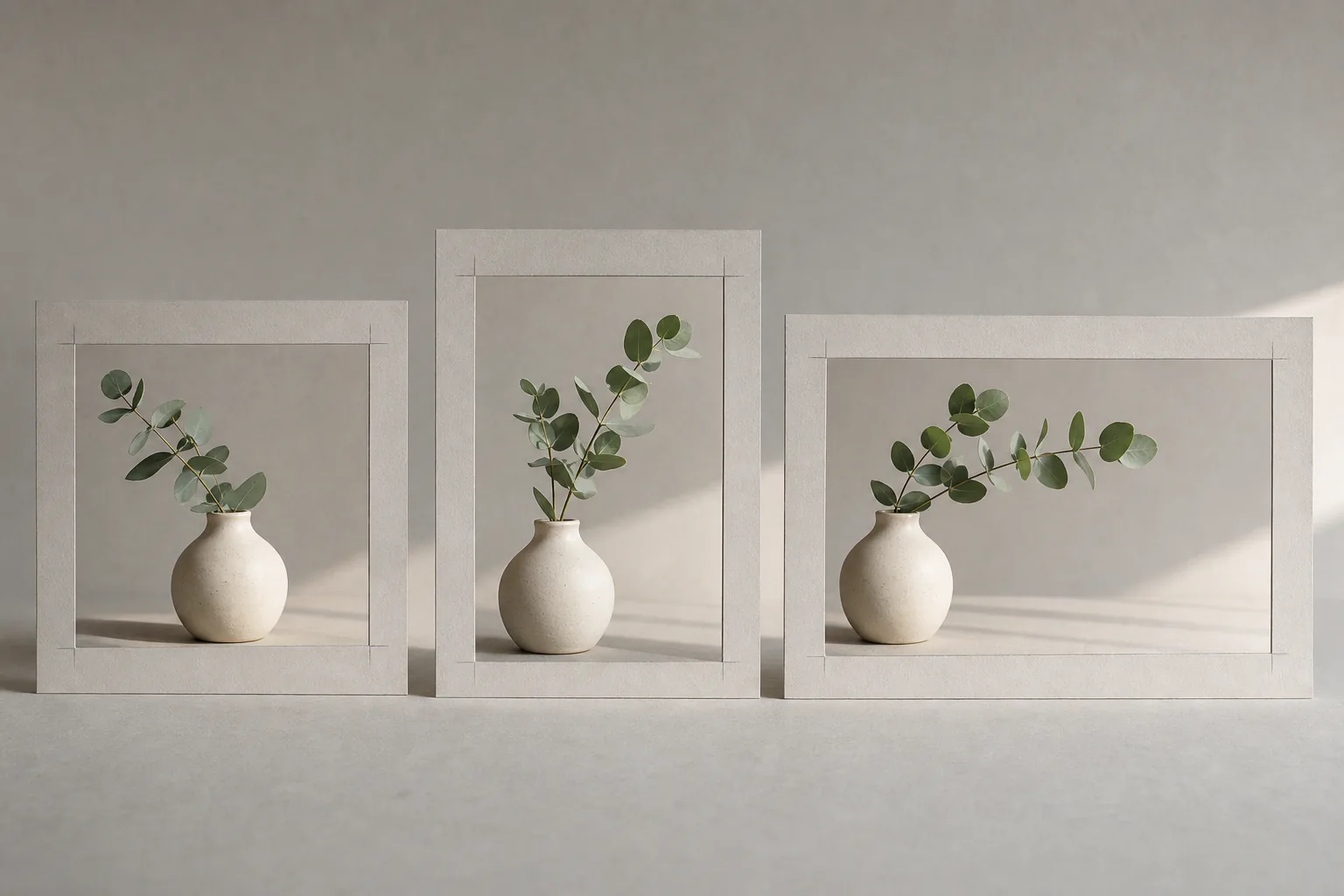
Also state what must remain visible: "full chair visible," "both hands in frame," or "entire product with space around the silhouette."
A requested edit changes everything else
Broad edit instructions encourage broad reinterpretation. "Make it better" gives the model permission to redesign the scene.
Use a local instruction instead:
Reduce only the saturation of the blue wall. Keep the person's face, clothing, pose, desk, lighting, and camera angle unchanged.
Run one focused pass at a time in the AI photo editor. Compare it with the previous file, especially around faces, product shapes, small objects, and background text. A successful local change can still introduce a new error elsewhere.
Repeated objects look melted or multiply
Rows of chairs, window grids, fingers, chains, shelves, and patterned fabric are difficult because small structural errors repeat. Reduce the number of repeated elements or make them less important to the composition.
For example, replace "a wall containing dozens of identical clocks" with "three large clocks mounted separately on a plain wall." If exact repetition is a requirement, generate a simpler base and assemble the repeated items in a conventional design tool.
Style references overpower the subject
A pile of style labels can pull in different directions: watercolor, photorealistic, 3D render, vintage film, vector art. Pick a medium first, then add one or two supporting traits.
"Editorial photograph with muted color and subtle film grain" is coherent. "Photorealistic watercolor vector render" is not.
Browse the AI image examples and notice which words describe medium, lighting, framing, or era. Copy the structure of a useful prompt, not every style keyword in it.
Use a three-pass repair method
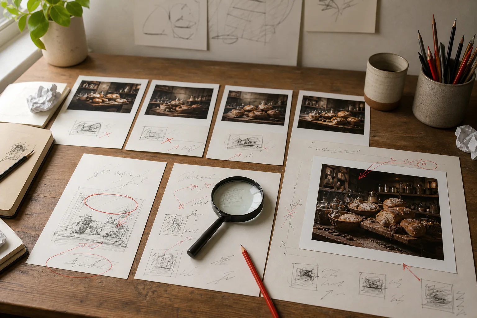
Start with the shortest prompt that can express the scene. Generate a baseline. For the second pass, fix the biggest compositional problem. For the third, refine one material, lighting, or color detail.
Stop when the image serves its purpose. Endless polishing can replace a good composition with a technically different but no more useful image. After choosing a result, run the publication quality checklist rather than assuming the final prompt produced a final file.