How to Keep a Consistent Visual Style Across a Set of AI Images
Build a repeatable visual system for blog covers, campaigns, and content series by controlling palette, light, framing, texture, and prompt structure.
An individual AI image can be excellent and still feel wrong beside the rest of a website. Consistency is not about making every picture look identical. It is about repeating enough visual decisions that the set feels edited by one person.
The easiest mistake is to use a new cluster of style words for every prompt. One cover becomes glossy 3D, the next resembles watercolor, and the third looks like high-contrast stock photography. Each may be attractive on its own, but together they weaken the publication.
Define five fixed choices
Create a short style note before generating the set. Fix these five variables:
- Medium: editorial photograph, cut-paper illustration, soft 3D render, ink drawing, or another single direction.
- Palette: name three or four color families and the level of saturation.
- Light: soft window light, flat studio light, overcast daylight, or a consistent illustrated equivalent.
- Framing: centered object, wide environmental scene, top-down arrangement, or another repeatable structure.
- Surface and texture: clean matte surfaces, visible paper grain, subtle film grain, rough natural materials, and so on.
Write the note in ordinary language. A useful system might be: "Quiet editorial still life; warm gray, muted green, and clay; soft daylight from one side; subject centered with generous margins; natural wood and paper texture; no visible words."
That sentence is more dependable than a list of trendy labels.
Separate the fixed style from the changing subject
Use a two-part prompt. The subject section changes; the style block stays almost untouched.
Subject:
A folded city map, compact camera, and train ticket arranged for an article about planning a weekend trip.
Fixed style block:
Quiet editorial still life, warm gray and muted green palette, soft daylight from the upper left, centered arrangement with generous margins, natural paper texture, realistic but restrained, no visible text, no logos.
For the next article, replace the travel objects while preserving the style block. This reduces accidental drift and makes differences easier to diagnose.
Build a small reference sheet
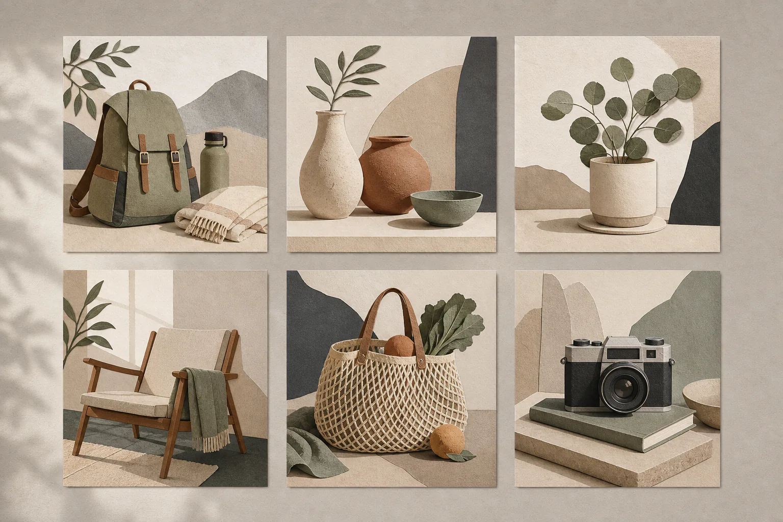
Generate three trial images with clearly different subjects. Place them side by side at the size they will appear on the website. A style that works for a ceramic cup may fail when the subject is a person or a landscape.
Ask practical questions:
- Do light and dark images alternate unpredictably?
- Does one subject fill the frame while another disappears?
- Are backgrounds simple enough for card crops?
- Does the palette still work in dark mode?
- Are fine textures visible at thumbnail size, or do they become noise?
Choose one successful image as a visual anchor. The anchor is not a template to copy exactly; it is the clearest example of the intended contrast, spacing, and mood.
Keep composition rules flexible but measurable
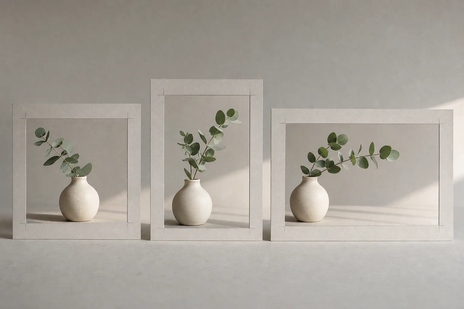
"Consistent" does not mean every object sits dead center. It can mean every subject stays within the middle 70 percent of the frame, faces look inward, and backgrounds leave quiet margins.
These simple rules survive different subjects better than a rigid layout. They also make it easier to crop covers for cards and related-article thumbnails.
Review the set in grayscale. If one image is dramatically darker or more contrasty, it will dominate even when the colors match. Tone is often a stronger signal of consistency than palette.
Correct outliers instead of regenerating the whole set
When one image feels unrelated, identify why. Is the light harder? Is the camera closer? Is the background more saturated? Correct that variable only.
In the AI photo editor, a focused instruction might be:
Reduce only the background saturation and soften the shadow edges to match a quiet daylight editorial photograph. Keep the objects, camera angle, crop, and surface unchanged.
Compare the result beside the whole set, not just beside its original. The goal is membership in the series.
Use templates without producing filler
A repeated style cannot rescue a generic concept. Each image should still communicate something specific about its article or campaign. For a guide about file formats, show a meaningful export or comparison scene, not another laptop with glowing shapes. For an article about product photography, show a real decision such as scale, texture, or background control.
Browse image examples and prompts to study how medium, framing, and lighting language changes a result. Then build your own fixed block instead of combining unrelated example prompts.
Save the system, not just the files
Keep a small record containing the fixed prompt block, preferred aspect ratios, export size, compression settings, and two or three approved examples. Note what failed as well. "Avoid glossy reflections" can be more valuable than another positive adjective.
When the visual direction changes, update the note deliberately and start a new series. Consistency should make production clearer, not prevent a publication from evolving.